Visual Exploration of the Diamonds Dataset Using ggplot2 in R
By Kelvin Kiprono in ggplot2
November 25, 2024
Introduction
The diamonds dataset, included in R’s ggplot2 package, is a widely used dataset for practicing data visualization and analysis.
- Objective: To uncover patterns, distributions, and relationships among diamond attributes using visualizations.
- Key Questions: -What are the distributions of key variables like price and carat? -How do attributes like cut, clarity, and color influence price? -Are there patterns or correlations between variables like carat and price?
Description of Variables
-price:Numeric; the price of the diamond in US dollars. -carat:Numeric; weight of the diamond (1 carat = 200 mg). -cut:Categorical; quality of the diamond’s cut: Fair, Good, Very Good, Premium, Ideal. -clarity:Categorical; internal purity: IF, VVS1, VVS2, VS1, VS2, SI1, SI2, I1. -color:Categorical; color grade: D (Colorless) to J (Noticeable Color).
library(ggplot2)
library(tidyverse)
## ── Attaching core tidyverse packages ──────────────────────── tidyverse 2.0.0 ──
## ✔ dplyr     1.1.4     ✔ readr     2.1.5
## ✔ forcats   1.0.0     ✔ stringr   1.5.1
## ✔ lubridate 1.9.3     ✔ tibble    3.2.1
## ✔ purrr     1.0.2     ✔ tidyr     1.3.1
## ── Conflicts ────────────────────────────────────────── tidyverse_conflicts() ──
## ✖ dplyr::filter() masks stats::filter()
## ✖ dplyr::lag()    masks stats::lag()
## ℹ Use the conflicted package (<http://conflicted.r-lib.org/>) to force all conflicts to become errors
library(dplyr)
Exploratory Data Analysis (EDA)
Univariate Analysis
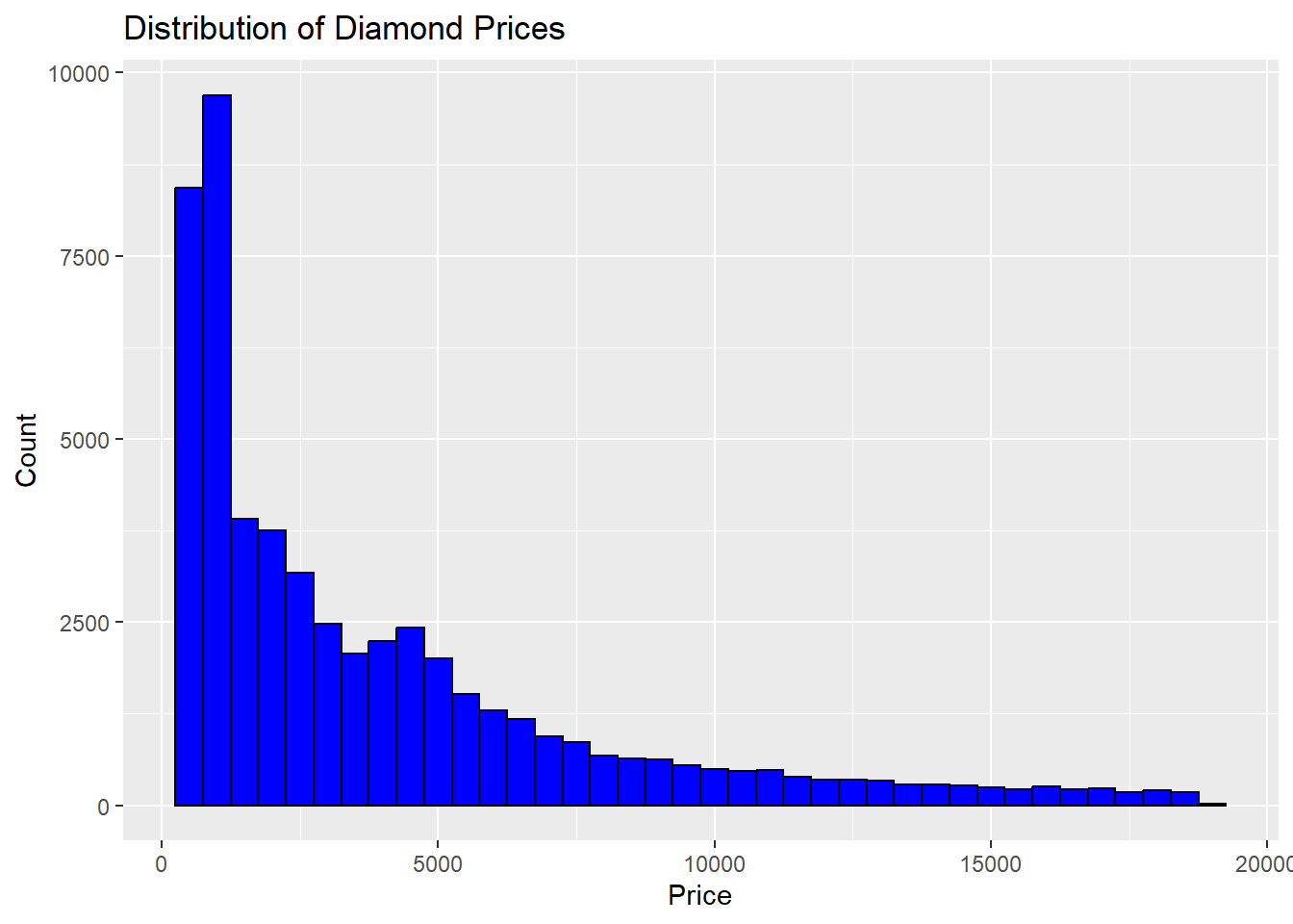
Price Distribution -Visualization: Histogram. -Insight: Identifies price range and skewness.
ggplot(diamonds, aes(x = price)) +
  geom_histogram(binwidth = 500, fill = "blue", color = "black") +
  labs(title = "Distribution of Diamond Prices", x = "Price", y = "Count")
Carat Distribution
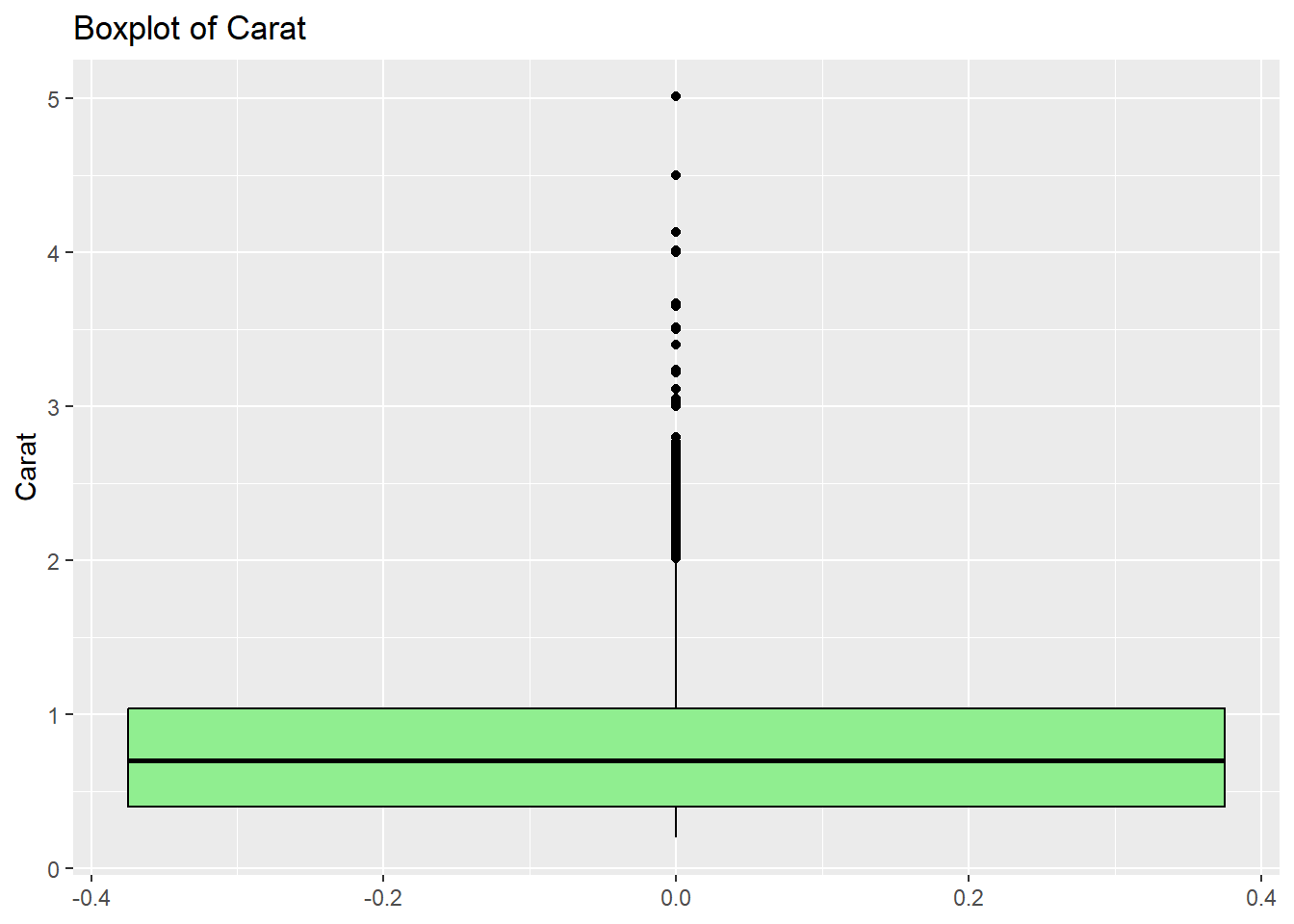
- Visualization: Boxplot.
- Insight: Highlights common carat sizes and outliers.
ggplot(diamonds, aes(y = carat)) +
  geom_boxplot(fill = "lightgreen", color = "black") +
  labs(title = "Boxplot of Carat", y = "Carat")
Cut Quality Distribution
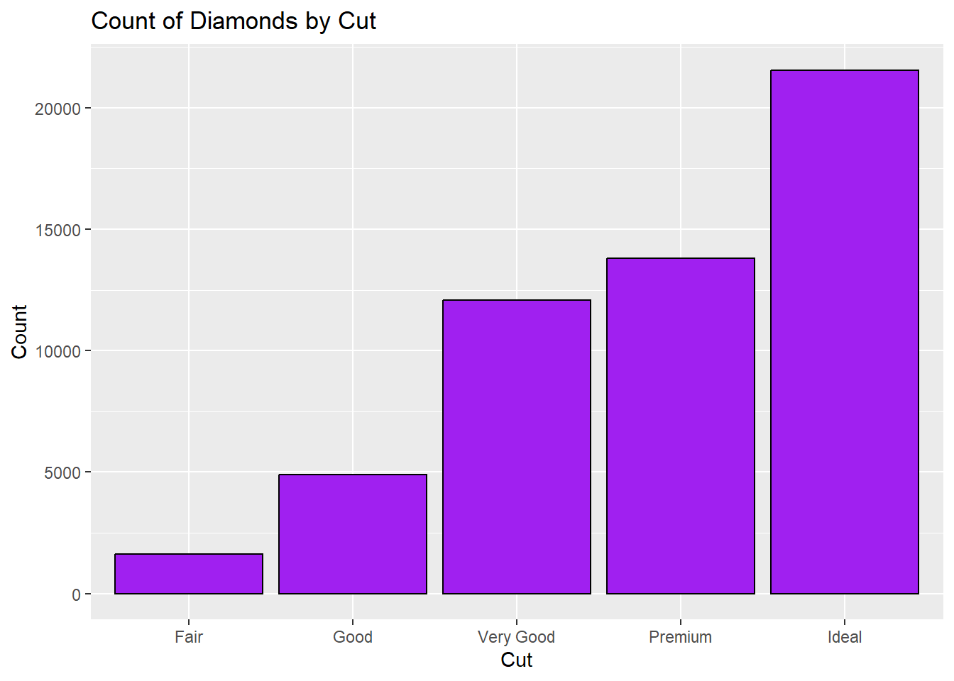
- Visualization: Bar chart.
- Insight: Shows the frequency of different cut categories.
ggplot(diamonds, aes(x = cut)) +
  geom_bar(fill = "purple", color = "black") +
  labs(title = "Count of Diamonds by Cut", x = "Cut", y = "Count")
BIVARIATE ANALYSIS
Carat vs. Price
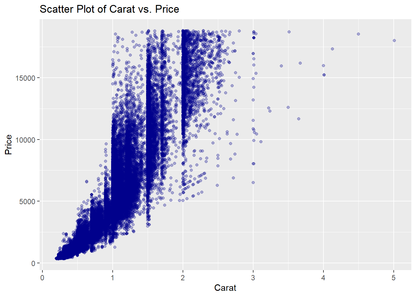
- Visualization: Scatter plot.
- Insight: Examines the relationship between carat size and price.
ggplot(diamonds, aes(x = carat, y = price)) +
  geom_point(alpha = 0.3, color = "darkblue") +
  labs(title = "Scatter Plot of Carat vs. Price", x = "Carat", y = "Price")
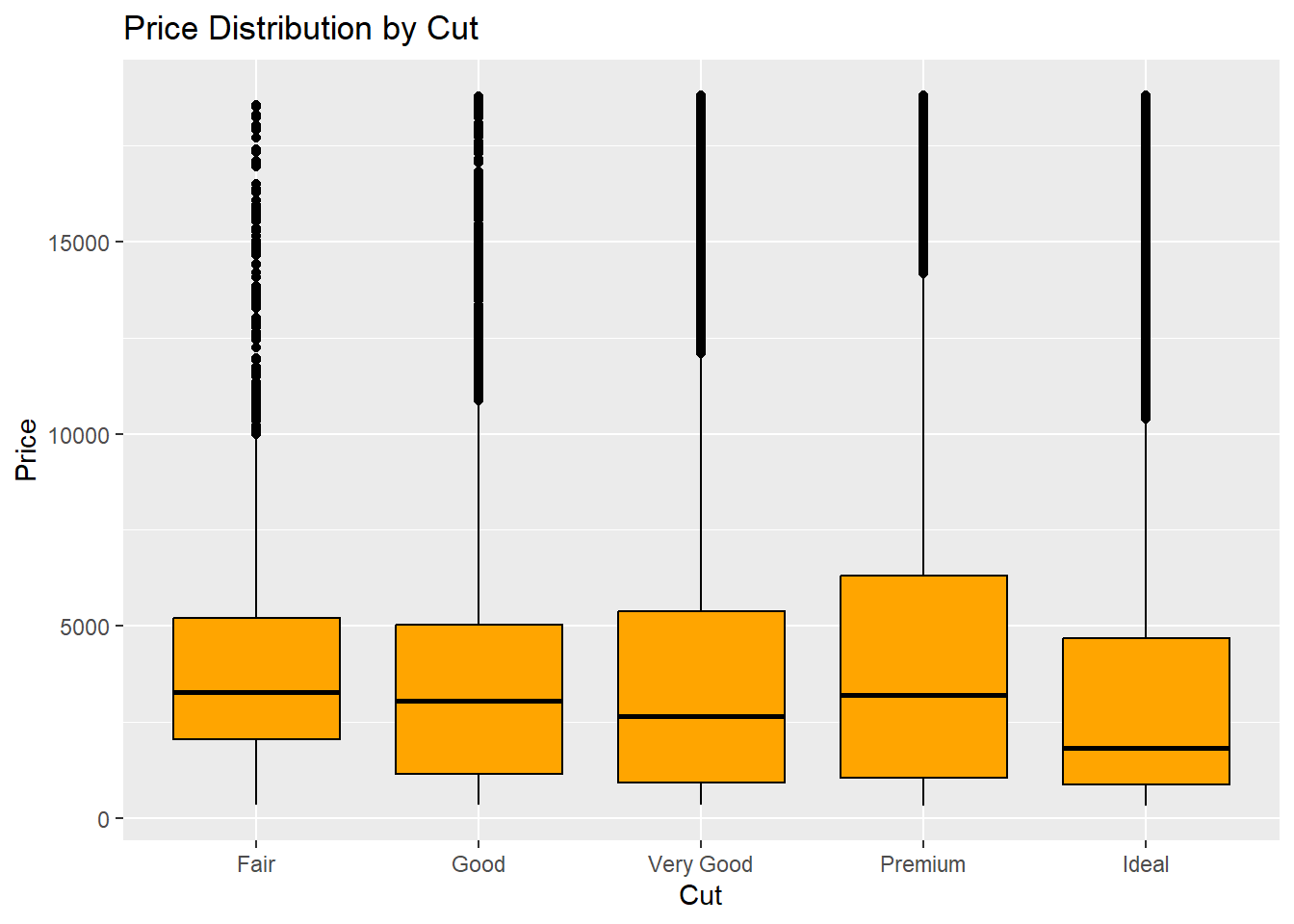
 Price by Cut
- Visualization: Boxplot.
- Insight: Compares price ranges across cut categories.
ggplot(diamonds, aes(x = cut, y = price)) +
  geom_boxplot(fill = "orange", color = "black") +
  labs(title = "Price Distribution by Cut", x = "Cut", y = "Price")
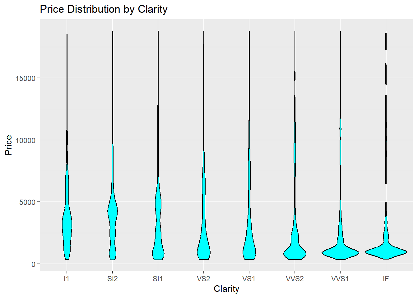
Price by Clarity
- Visualization: Violin plot.
- Insight: Shows the distribution of price for each clarity grade.
ggplot(diamonds, aes(x = clarity, y = price)) +
  geom_violin(fill = "cyan", color = "black") +
  labs(title = "Price Distribution by Clarity", x = "Clarity", y = "Price")
 MULTIVARIATE ANALYSIS
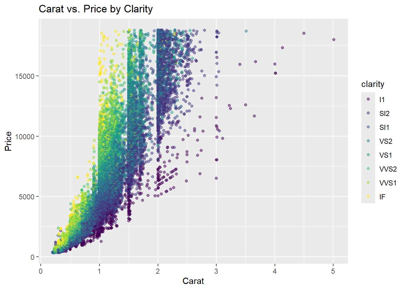
Carat vs. Price by Clarity
- Visualization: Scatter plot with clarity as color.
- Insight: Explores how clarity influences the carat-price relationship.
ggplot(diamonds, aes(x = carat, y = price, color = clarity)) +
  geom_point(alpha = 0.5) +
  labs(title = "Carat vs. Price by Clarity", x = "Carat", y = "Price")
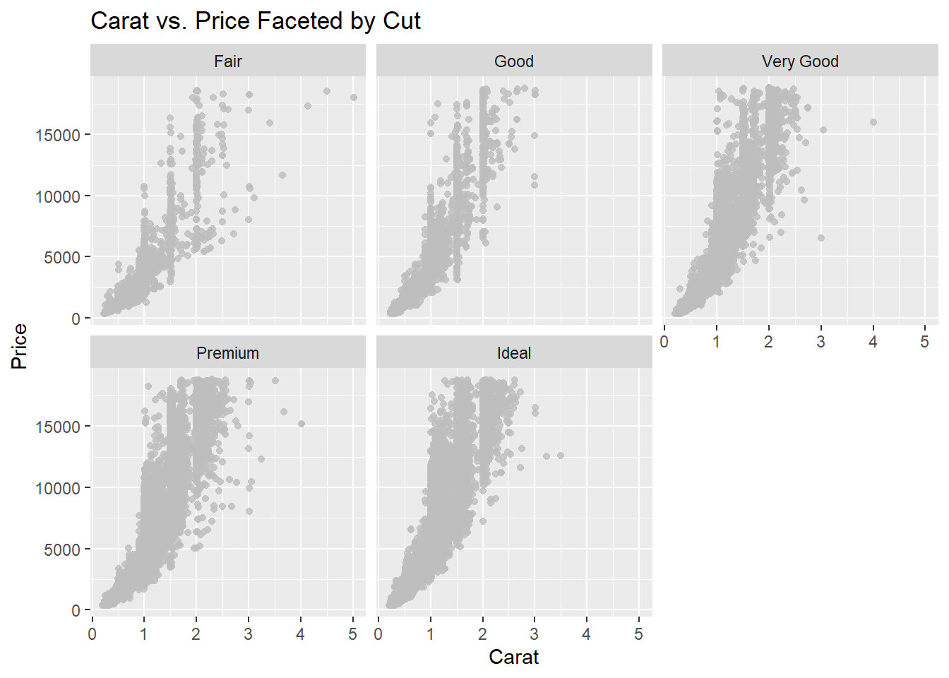
Carat vs. Price by Cut
- Visualization: Faceted scatter plot.
- Insight: Examines variations in the carat-price relationship across cuts.
ggplot(diamonds, aes(x = carat, y = price)) +
  geom_point(alpha = 0.8, color = "grey") +
  facet_wrap(~cut) +
  labs(title = "Carat vs. Price Faceted by Cut", x = "Carat", y = "Price")
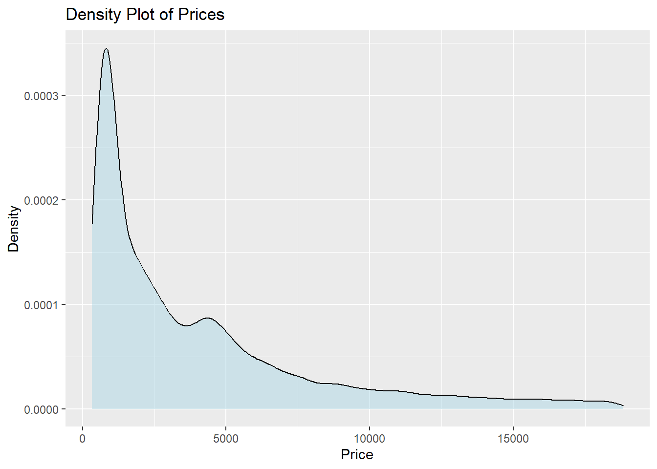
 Price Density Plot
- Visualization: Density plot.
- Insight: Highlights peaks and smooth distribution of prices.
options(scipen = 1000)
ggplot(diamonds, aes(x = price)) +
  geom_density(fill = "lightblue", alpha = 0.5) +
  labs(title = "Density Plot of Prices", x = "Price", y = "Density")
Using transition_time (from gganimate package)
This is useful when visualizing how a variable changes over time or sequentially through categories. Although the diamonds dataset doesn’t include a time variable, you can create sequences based on categorical or numeric variables for animation.
Animate Price Distribution by Cut or Clarity Animate how the price distribution evolves for different cut or clarity categories.
library(gganimate)
## Warning: package 'gganimate' was built under R version 4.4.2
ggplot(diamonds, aes(x = price)) +
  geom_histogram(binwidth = 500, fill = "skyblue", color = "black") +
  labs(title = "Price Distribution by Cut", x = "Price", y = "Count") +
  transition_states(cut, transition_length = 2, state_length = 1) +
  labs(subtitle = "Cut: {closest_state}")

Animate Carat vs. Price by Clarity Show how the carat-price relationship changes for different clarity grades.
ggplot(diamonds, aes(x = carat, y = price, color = clarity)) +
  geom_point(alpha = 0.5) +
  labs(title = "Carat vs. Price by Clarity", x = "Carat", y = "Price") +
  transition_states(clarity, transition_length = 2, state_length = 1) +
  labs(subtitle = "Clarity: {closest_state}")

Using patchwork (from patchwork package)
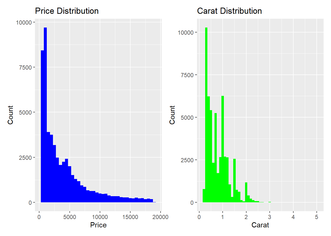
-Side-by-Side Comparison of Univariate Distributions Combine histograms of price and carat distributions.
library(patchwork)
## Warning: package 'patchwork' was built under R version 4.4.2
plot_price <- ggplot(diamonds, aes(x = price)) +
  geom_histogram(binwidth = 500, fill = "blue") +
  labs(title = "Price Distribution", x = "Price", y = "Count")

plot_carat <- ggplot(diamonds, aes(x = carat)) +
  geom_histogram(binwidth = 0.1, fill = "green") +
  labs(title = "Carat Distribution", x = "Carat", y = "Count")

plot_price + plot_carat
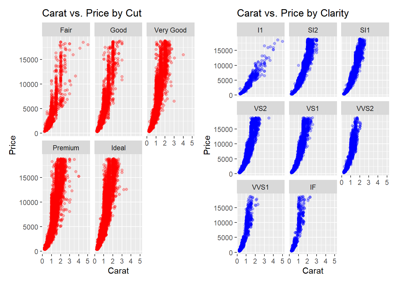
#Comparing Relationships Across Variables Place scatter plots of carat vs. price faceted by cut and clarity together for better comparison.
plot_cut <- ggplot(diamonds, aes(x = carat, y = price)) +
  geom_point(alpha = 0.3, color = "red") +
  facet_wrap(~cut) +
  labs(title = "Carat vs. Price by Cut", x = "Carat", y = "Price")

plot_clarity <- ggplot(diamonds, aes(x = carat, y = price)) +
  geom_point(alpha = 0.3, color = "blue") +
  facet_wrap(~clarity) +
  labs(title = "Carat vs. Price by Clarity", x = "Carat", y = "Price")

plot_cut | plot_clarity
 Animate Price Density Plot by Clarity
ggplot(diamonds, aes(x = price, fill = clarity)) +
  geom_density(alpha = 0.5) +
  labs(title = "Price Density Across Clarity Grades",
       x = "Price", y = "Density",
       subtitle = "Clarity: {closest_state}") +
  transition_states(clarity, transition_length = 2, state_length = 1) +
  theme_minimal()

Conclusion
Visualizations provide a clear understanding of the diamonds dataset, revealing key trends and relationships.