ggplot2
Getting Started with ggplot2 in R
By Kelvin Kiprono in ggplot2
September 15, 2024
ggplot2 is one of the most popular data visualization packages in R, known for its versatility and ease of creating beautiful, complex graphics. It’s built on the “grammar of graphics” concept, which provides a logical structure for building a plot in layers. Whether you’re new to data visualization or experienced in R, ggplot2 offers an intuitive and powerful approach to creating plots.
Key Components of ggplot2
The grammar of graphics in ggplot2 consists of several components:
- Data: The dataset you want to plot.
- Aesthetics (aes): Mappings that define how data variables are visualized, such as x and y coordinates, colors, shapes, and sizes.
- Geometries (geom): The type of plot (e.g., points, lines, bars).
- Facets: Separate plots by subsets of data (e.g., different panels for each group).
- Statistics (stat): Representations of data summaries (e.g., counts, averages).
- Coordinates (coord): Control the mapping of data to the plotting space.
- Themes: Adjust the non-data elements, such as text, axes, backgrounds, and colors.
We are going to explore the penguins data from the palmerpenguins package.
Loading dataset
library(palmerpenguins)
library(tidyverse)
## ── Attaching core tidyverse packages ──────────────────────── tidyverse 2.0.0 ──
## ✔ dplyr     1.1.4     ✔ readr     2.1.5
## ✔ forcats   1.0.0     ✔ stringr   1.5.1
## ✔ ggplot2   3.5.1     ✔ tibble    3.2.1
## ✔ lubridate 1.9.3     ✔ tidyr     1.3.1
## ✔ purrr     1.0.2
## ── Conflicts ────────────────────────────────────────── tidyverse_conflicts() ──
## ✖ dplyr::filter() masks stats::filter()
## ✖ dplyr::lag()    masks stats::lag()
## ℹ Use the conflicted package (<http://conflicted.r-lib.org/>) to force all conflicts to become errors
head(penguins,5)
## # A tibble: 5 × 8
##   species island    bill_length_mm bill_depth_mm flipper_length_mm body_mass_g
##   <fct>   <fct>              <dbl>         <dbl>             <int>       <int>
## 1 Adelie  Torgersen           39.1          18.7               181        3750
## 2 Adelie  Torgersen           39.5          17.4               186        3800
## 3 Adelie  Torgersen           40.3          18                 195        3250
## 4 Adelie  Torgersen           NA            NA                  NA          NA
## 5 Adelie  Torgersen           36.7          19.3               193        3450
## # ℹ 2 more variables: sex <fct>, year <int>
tail(penguins,5)
## # A tibble: 5 × 8
##   species   island bill_length_mm bill_depth_mm flipper_length_mm body_mass_g
##   <fct>     <fct>           <dbl>         <dbl>             <int>       <int>
## 1 Chinstrap Dream            55.8          19.8               207        4000
## 2 Chinstrap Dream            43.5          18.1               202        3400
## 3 Chinstrap Dream            49.6          18.2               193        3775
## 4 Chinstrap Dream            50.8          19                 210        4100
## 5 Chinstrap Dream            50.2          18.7               198        3775
## # ℹ 2 more variables: sex <fct>, year <int>
levels(penguins$species)
## [1] "Adelie" "Chinstrap" "Gentoo"
levels(penguins$sex)
## [1] "female" "male"
count(penguins,sex)
## # A tibble: 3 × 2
##   sex        n
##   <fct>  <int>
## 1 female   165
## 2 male     168
## 3 <NA>      11
First, you need to install and load ggplot2
library(ggplot2)
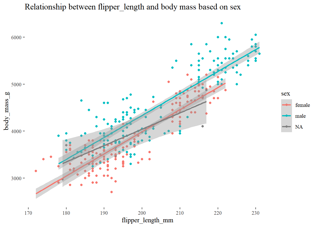
ggplot(penguins,aes(flipper_length_mm,body_mass_g,colour = sex)) +
  geom_point() +
  geom_smooth(method='lm')+
  theme_minimal()+
  ggthemes::theme_tufte() +
  ggtitle("Relationship between flipper_length and body mass based on sex")
## `geom_smooth()` using formula = 'y ~ x'

## Warning: Removed 2 rows containing non-finite outside the scale range
## (`stat_smooth()`).

## Warning: Removed 2 rows containing missing values or values outside the scale range
## (`geom_point()`).

-
The plot shows relationship between flipper_length and body mass differentiated by sex.
-
ggplot2 allows for extensive customization through themes. Use theme_minimal(), theme_classic(), or other themes to change the appearance, or customize individual elements with theme()
-
ggthemes:: theme_tufte() removes the unnecessary background grids and colours.
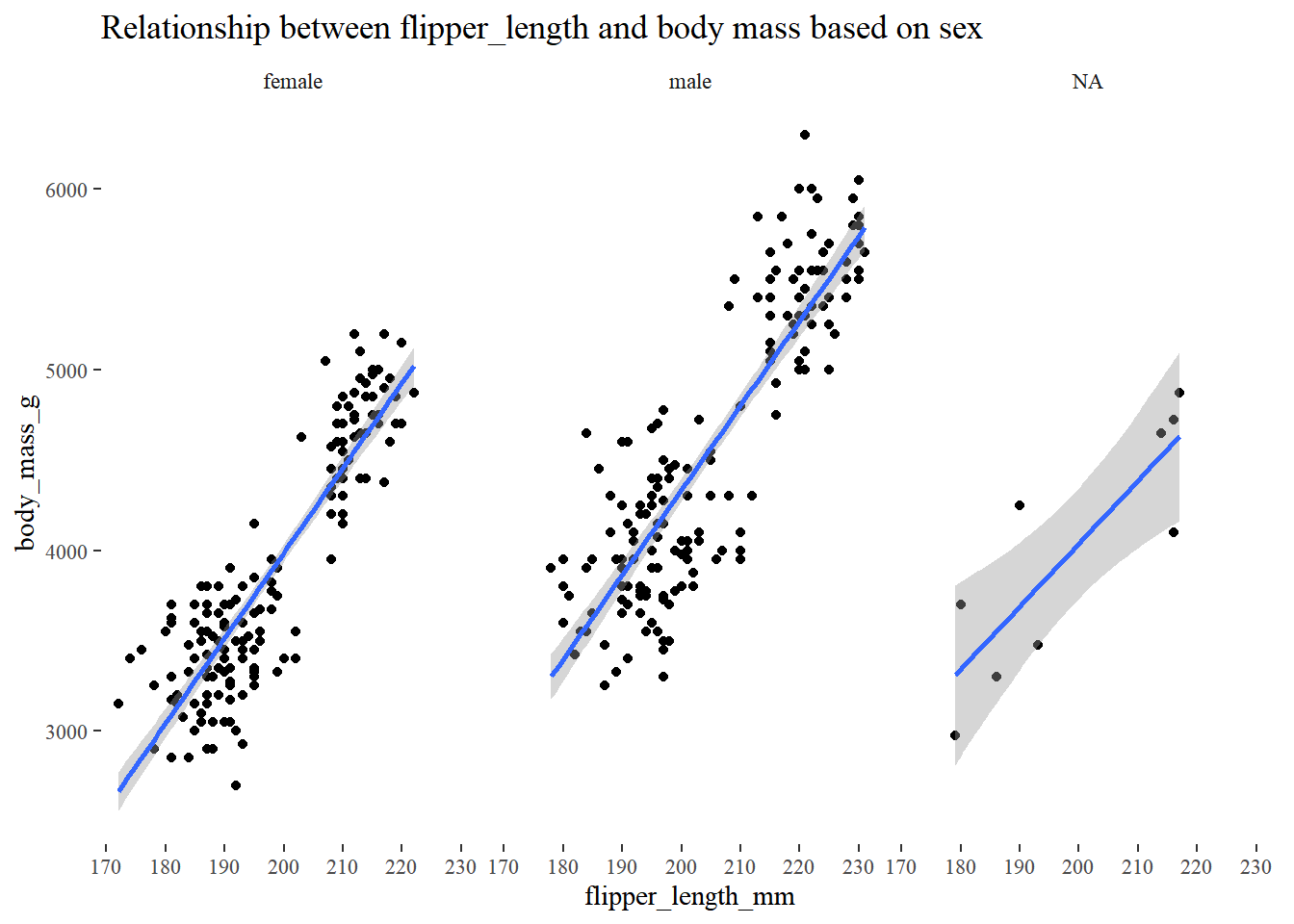
ggplot(penguins,aes(flipper_length_mm,body_mass_g)) +
  geom_point() +
  geom_smooth(method='lm')+
  facet_wrap(~sex)+
  theme_minimal()+
  ggthemes::theme_tufte() +
  ggtitle("Relationship between flipper_length and body mass based on sex")
## `geom_smooth()` using formula = 'y ~ x'

## Warning: Removed 2 rows containing non-finite outside the scale range
## (`stat_smooth()`).

## Warning: Removed 2 rows containing missing values or values outside the scale range
## (`geom_point()`).

library(plotly)
## Warning: package 'plotly' was built under R version 4.4.2

##
## Attaching package: 'plotly'

## The following object is masked from 'package:ggplot2':
##
##     last_plot

## The following object is masked from 'package:stats':
##
##     filter

## The following object is masked from 'package:graphics':
##
##     layout
Plotly is an interactive graphing library for R that makes it easy to create interactive, web-ready visualizations. It is particularly useful for exploring data, sharing findings, and building dashboards with enhanced user experiences.
relationship <- ggplot(penguins,aes(flipper_length_mm,body_mass_g,colour = sex)) +
  geom_point() +
  geom_smooth(method='lm')+
  theme_minimal()+
  ggthemes::theme_tufte() +
  ggtitle("Relationship between flipper_length and body mass based on sex")
ggplotly(relationship)
## `geom_smooth()` using formula = 'y ~ x'

## Warning: Removed 2 rows containing non-finite outside the scale range
## (`stat_smooth()`).
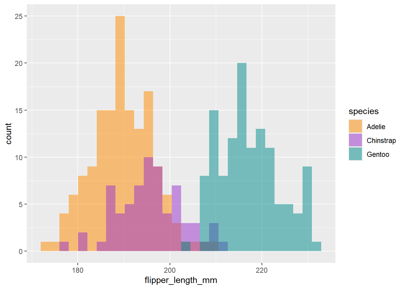
ggplot(data = penguins, aes(x = flipper_length_mm)) +
  geom_histogram(aes(fill = species), alpha = 0.5, position = "identity") +
  scale_fill_manual(values = c("darkorange","darkorchid","cyan4"))
## `stat_bin()` using `bins = 30`. Pick better value with `binwidth`.

## Warning: Removed 2 rows containing non-finite outside the scale range
## (`stat_bin()`).

Flipper <- ggplot(data = penguins, aes(x = flipper_length_mm)) +
  geom_histogram(aes(fill = species), alpha = 0.5, position = "identity") +
  scale_fill_manual(values = c("darkorange","darkorchid","cyan4"))
ggplotly(Flipper)
## `stat_bin()` using `bins = 30`. Pick better value with `binwidth`.

## Warning: Removed 2 rows containing non-finite outside the scale range
## (`stat_bin()`).
Conclusion
With its layered grammar approach, ggplot2 is ideal for creating both basic and complex visualizations. It’s an essential package for anyone working with data in R and is highly flexible, enabling users to convey insights effectively with minimal code. Try experimenting with different geoms, facets, and themes to unlock the full potential of your data visualizations!